Feeling a little color shy? But at the same time, are you primed to turn your home into a source of happiness and true comfort?
In my experience as an interior designer, I’ve occasionally worked with homeowners who are hesitant to add color to their interiors. But not because they don’t appreciate or like it. They just aren’t sure about where or even how to best weave colors together and into their preferred spaces.
Feeling a similar way? Let’s warm you up (even more) to the idea of using livelier tones to create charming surroundings, boost moods, and inspire feelings of comfort and joy from the moment you walk through the door.
A Bit of the Brains Behind Color – The Psychology
Opting for all neutrals can seem like the safer bet (and there’s certainly a place for subtlety in virtually any scheme!). However, incorporating playfulness into your palette gives you more room to design spaces that genuinely set the tone for joyful living.
For starters, color can help you craft a primary suite that encourages relaxation, or an office that fosters creativity. It can be used strategically to establish an ambience and even affect a person’s mood as they enter any room. So much so that, for years, the topic of the emotional effects different colors can have on a person has been heavily researched by psychologists.
But wisely decorating with color doesn’t require a degree in neuroscience. You can start by simply paying more attention to your interactions with color and trusting your instincts. Take a walk and notice which tones energize or relax you. Scroll through Pinterest and see what catches your eye. Does a splash of yellow bring a smile to your face? Do certain combinations just seem to “fit” – even if you can’t quite articulate why?
Color surrounds us constantly. Practice opening your eyes more to how you react to it, and let those feelings guide your choices.
A Lesson on Color Harmony – Pulling Together the Perfect Palette
What I love about color theory is that it provides a solid jumping-off point. So you’re not going in blindly. We can all lean on it as inspiration when dreaming up palettes in the early stages of the design process.
To get you going, let me don my teaching hat for a moment with a mini lesson:
Red, blue, and yellow are our primary colors. Mix any of these, and you get secondary colors like green, orange, and purple. Then, when you blend primary and secondary, you get even more shades, like blue-green. This simple mixing process gives us the color wheel, a tool that shows how all these colors play together and complement one another.
Using it, you can pull together various color palettes that’ll guide your design choices, such as:
- A triadic color scheme – keeps consistency by pulling three evenly-spaced colors from the color wheel. Draw a triangle anywhere on the color wheel, and each point will represent a distinct hue in your palette. This is a simple way to achieve a diverse, visually striking aesthetic without fear of “clashing” colors.
- A monochromatic color scheme – dives deep into the nuances of a single hue, incorporating various shades of it. By following this approach, you add depth and richness to a favorite color you want to showcase frequently throughout your design.
- An analogous color scheme – a trio of hues that sit next to each other on the color wheel. Finding balance is a breeze with this palette, as the colors naturally play well together, creating a harmonious aesthetic.
- A complementary color scheme – uses colors that sit directly across from each other on the color wheel. It balances light and dark, hot and cold, creating a dynamic interplay that engages the senses and demands attention.
All that to say, pulling together the perfect palette is a delicate blend of creativity and technique. But not to worry; you’re completely capable and the results will be worth it. So, let’s roll up those sleeves and continue learning more, shall we?
6 Lessons in Using Color in Interior Design
1. THE PERFECT PALETTE IS SUBJECTIVE
Understanding the “rules” is just the first step. What comes next is the fun part: bending or even breaking them altogether. While color theory and the psychology behind it is an invaluable guide, creating the perfect palette is entirely up to you to define. After all, your home is the only place in the world that’s completely your own. So when something sparks joy, comfort, or inspiration, go for it! Your realm, your rules.
While I’ve studied color theory, I still have my own preferences. Don’t we all? That’s why I always consider client preferences and lifestyles when choosing colors. Personally, I’m a big fan of any scheme that involves yellow. But I love it most when paired with blue. It’s radiant, yet classic. Fun without feeling too loud. At least that’s how I see it. You may feel that way about a different color pairing.
And if you’re curious about other favorites of mine? Take a peek to see if anything catches your eye.
Photographer: Heather Talbert
Styling: Centered by Design
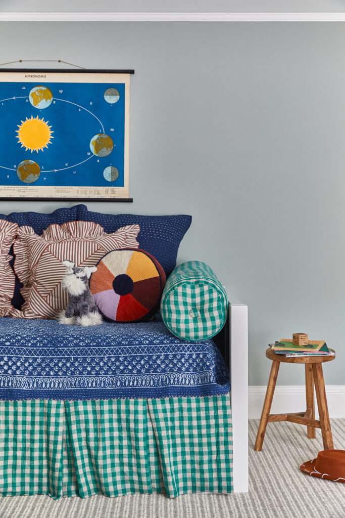
Notice a variety of greens and blues? And even some purple details to round out the scheme while helping step away from traditional gender norms so personality can take center stage! I often ground a colorful scheme with navy or black as it can lend a sophisticated touch to what otherwise might be perceived as a cutesy kid’s room.
If you’re curious about curating a color palette that feels seamless, here are a few tips to support you:
- Start by considering the purpose of your space. This will help you pinpoint the desired atmosphere you wish to cultivate. A living room might call for cozy comfort. For a bedroom, maybe it’s peace and tranquility. Spaces like family rooms and playrooms for all ages should exude a laid-back, inviting, and playful energy.
- Select a dominant color that reflects the mood you’re aiming for. Then refer back to the color wheel. Whether you opt for a monochromatic, analogous, triadic, or complementary scheme, let the wheel take you toward more cohesive combinations.
- Embrace the unexpected. Sometimes, it’s the surprising detail that ties everything together! Think of accents and décor – like a throw pillow or piece of art – as the medium for incorporating a burst of vibrancy throughout your space, transforming your complementary palette from mundane to magnificent.
2. PATIENCE & EXPERIMENTATION WORK WONDERS
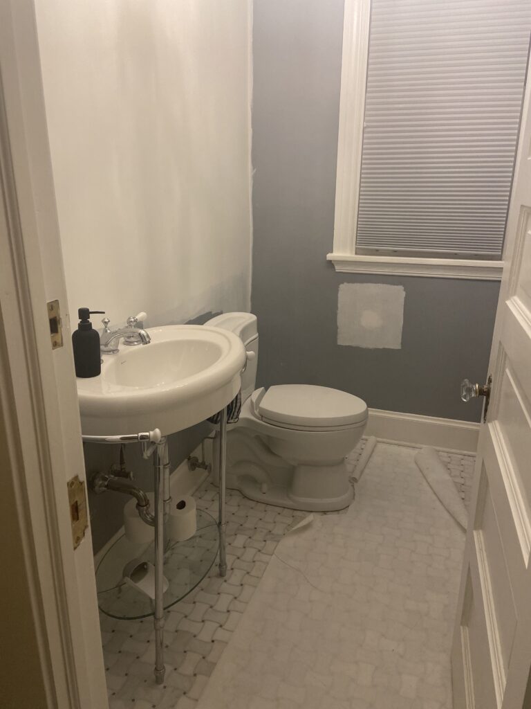
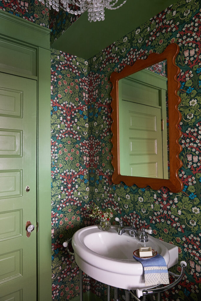
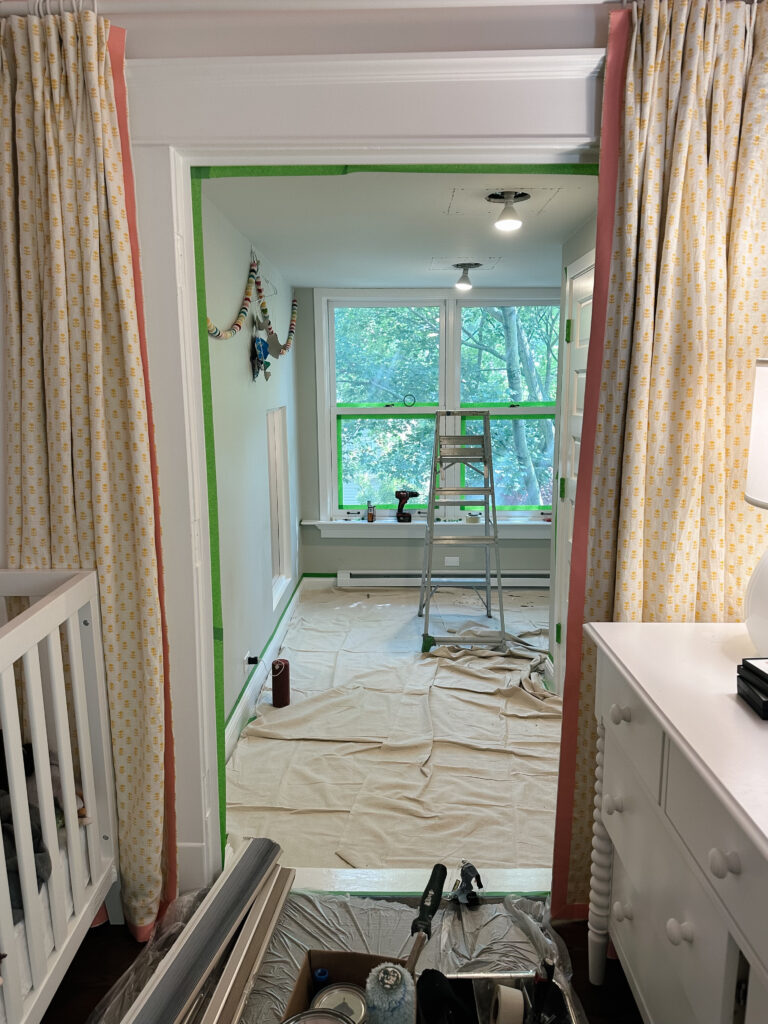
When you’re dipping your toe into the act of using color in interior design, it can help to start with a low-pressure space. Kids’ rooms and powder rooms are a great place to experiment. With powder rooms, you don’t usually have to worry about how and where to continue color and patterns, as you do in a larger, open space.
Styling: Centered by Design
If painting walls is part of your design, large swatches will be your best friend before the real work begins. Essentially, don’t rely on the tiny swatches you get at the store. Instead, paint a sample of the color on every wall you’re considering (or even on a posterboard), and leave it there for a couple of days. Observe how the color looks at different times, with the blinds open and closed, lights on and off, and so on. It may call for more patience, but trust me – it’s worth it in the long run so you don’t have to repaint an entire room.
Speaking of, what if you’re feeling unsure about your palette after experimenting with swatches? That’s what this experience is for! In fact, you probably won’t get it 100% right on the first go. Designing your home is a labor of love, meaning it’s obviously going to take time to bring your vision to life.
Whenever something feels off, trust your gut and pivot. Whether it’s tweaking colors, swapping them out completely, or even starting anew, flexibility is key. It’s all part of the creative process!
3. COLOR DOESN’T STOP WITH PAINT
When you think about infusing your home with color, paint may be the first thing that comes to mind. But it’s not your only option. You can go as far as applying your scheme to your furniture, textile, and accent choices.
Read through some of my favorite ways to add pops of color – beyond the brush:
- Deck the walls. Gone are the days of drab, dated wallpaper reminiscent of granny’s cottage. It’s the perfect avenue to channel a color scheme using pattern and print. It makes a statement in small and large rooms alike, whether it’s used for an entire wall, half wall, or trim. And let me tell you, it’s one of my favorite design elements to introduce into a room!
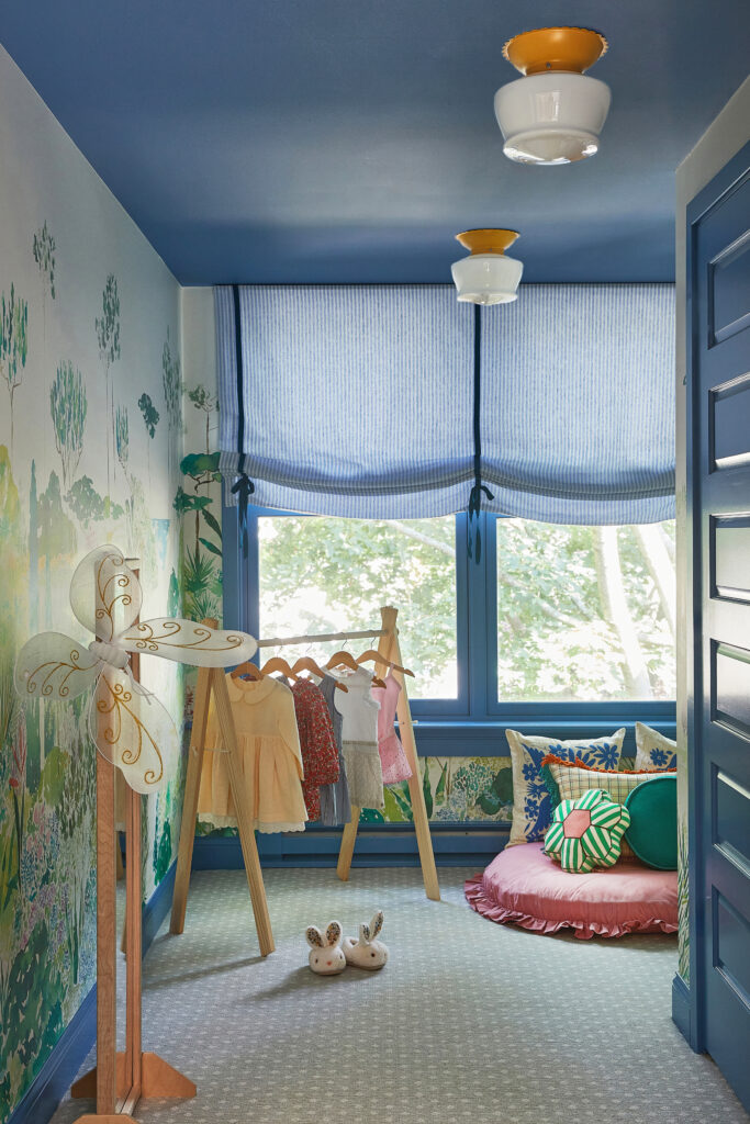
Styling: Centered by Design
- Consider your current treasures. Have meaningful objects or heirlooms you want to place in your space? Ensure your color palette complements them! Use pops of color to enhance focal points, such as bringing out the beauty of antique furniture you plan to keep.
- Focus on textiles. Think pillows and throws or impermanent objects like lampshades or books to bring in the color you crave. These are easy to swap out seasonally or as your preferences change.
- Make a statement with artwork or rugs. Large-scale art or an area rug can be just as impactful! Pro tip: Vintage rugs often have a faint variation in color, which brings in more character, depth, and warmth when compared to most saturated synthetic options available today.
4. REPETITION IS YOUR FRIEND
You might think it could lead you to feel like you’re living in a sea of sameness, but really, repetition is key to tying everything together. You’ll create a throughline within your home and have a great starting point for when you get to work on the next room.
Now, I’m not saying you should paint every wall the same shade of beige or drown every seated surface in identical throw pillows. But finding that common thread helps create cohesion. Maybe your front living room walls are painted blue, and your kitchen roman shades are a blue patterned fabric.
Let’s take my love for blue hues, for example. From the minute you walk up to our home, you’re greeted by a light blue door. And as you venture further inside, you’ll find features within the same color family.
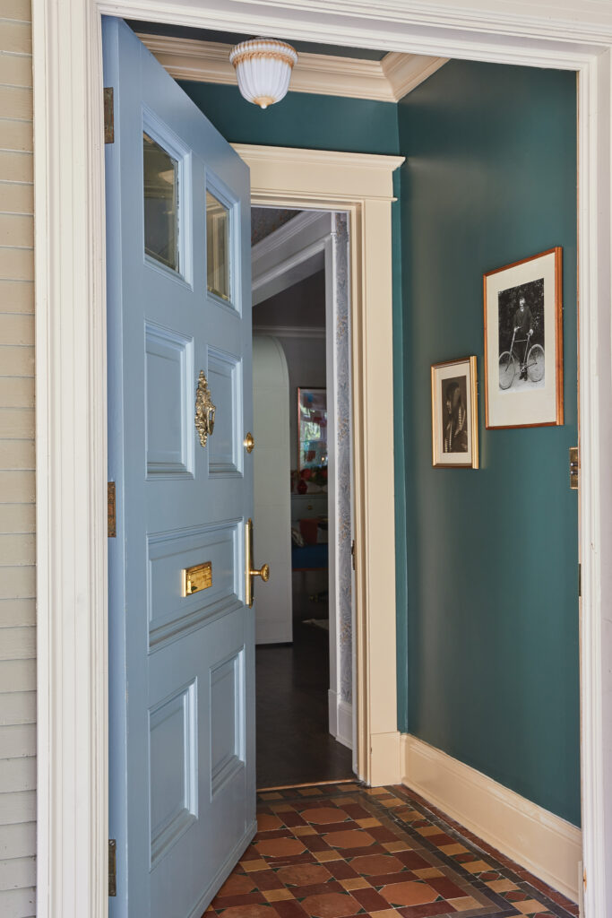
Styling: Centered by Design
See? Having a common theme can subtly connect each room, providing a solid foundation for personal expression and creativity.
5. COLOR CAN BE TIMELESS
There’s so much buzz about neutrals these days. So I’m here to dispel the myth that for your home design to be timeless (and even help with resale value), it needs to be beige and gray and basic.
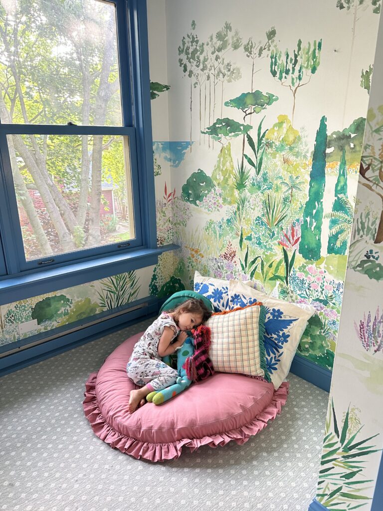
Nobody wants a home to feel temporary – even if it’s not what you consider to be yours “forever.” Color is a striking way to make it your own! And in doing so, you create enduring appeal. When done purposefully, your preferred palettes will establish a sense of permanence, making your surroundings feel meaningful and well-loved.
6. EVERY SPACE CAN USE A LITTLE COLOR
Every nook and cranny can benefit from a splash of color. That said, don’t shy away from using vibrant hues within smaller spaces for fear of overwhelming or cluttering the room. Us interior designers have plenty of clever tricks up our sleeves to liven up diverse areas.
For example, a patterned wallpaper can bring visual interest to a small space without adding to the amount of “stuff” in the room. And an interesting area rug can have a similar effect with an equally cozy appeal.
I’ve yet to see a space that couldn’t benefit from some pop of joy, even as small as a bouquet of fresh flowers or a houseplant or two! Incorporating color in this way is such a low commitment, but it makes a subtly significant difference.
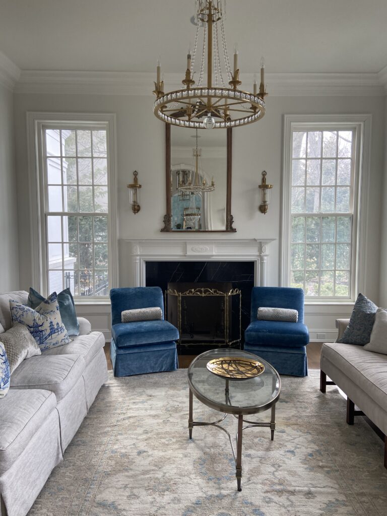
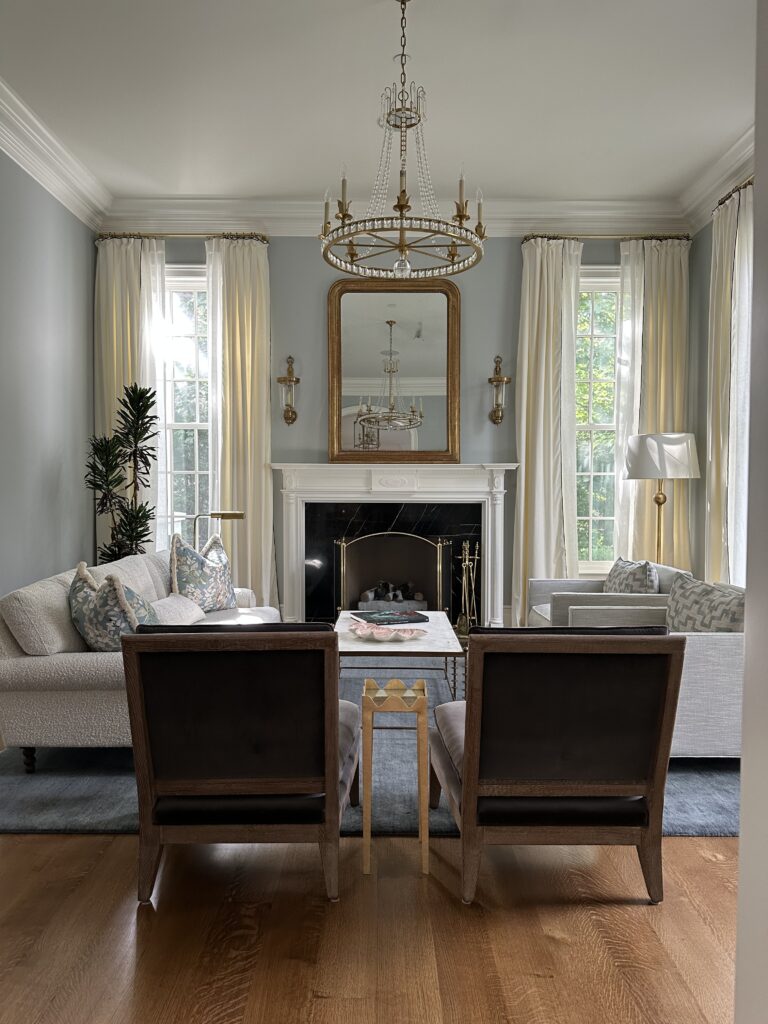
Now, over to you! After reading through these lessons, think about which room(s) in your home could benefit from a vibrant makeover. If you’re not sure where to start, I’m here to help!
Let’s explore the possibilities of bringing color into your interiors over a complimentary inquiry call.
“The colors and patterns Meghan helped us choose have given our home a unique and fresh new look. Meghan was a joy to work with!”
– LAUREN